/* global React */
/* JXM Brand Standards — Foundations 2: Type, Spacing, Motion */

/* =========================================================================
   TYPOGRAPHY
   ========================================================================= */
function TypePage() {
  const families = [
  {
    name: 'Inter',
    role: 'Display',
    use: 'Headlines, page titles, large display moments.',
    weights: '300 / 400 / 500 / 600',
    ff: "var(--ff-display)",
    sample: 'Strategy that shows its work.',
    sampleStyle: { fontWeight: 300, fontSize: 'clamp(2.5rem, 6vw, 5.5rem)', letterSpacing: '-0.04em', lineHeight: 0.95 }
  },
  {
    name: 'DM Sans',
    role: 'Body',
    use: 'Paragraphs, lists, captions, UI.',
    weights: '400 / 500',
    ff: "var(--ff-body)",
    sample: 'DM Sans handles every word that isn\u2019t a headline — the part someone actually has to read. Calm, technically precise, with just enough character to feel picked, not assigned.',
    sampleStyle: { fontWeight: 400, fontSize: 'clamp(1.0625rem, 1.5vw, 1.25rem)', lineHeight: 1.55, maxWidth: '52ch' }
  },
  {
    name: 'IBM Plex Mono',
    role: 'Spec & eyebrow',
    use: 'Eyebrows, labels, metadata, technical specs.',
    weights: '400 / 500',
    ff: "var(--ff-mono)",
    sample: 'SECTION  /  EYEBROW LABEL  /  SPEC DATA  /  12.04.2026',
    sampleStyle: { fontSize: 'clamp(0.875rem, 1vw, 1rem)', letterSpacing: '0.16em', textTransform: 'uppercase' }
  },
  {
    name: 'Libre Baskerville',
    role: 'Editorial accent',
    use: 'Standalone pull quotes. Never mixed into Inter headlines, never in body.',
    weights: 'Italic 400',
    ff: "var(--ff-edit)",
    sample: 'Reserved for a quiet, standalone editorial moment — never a single italic word stitched into an Inter headline.',
    sampleStyle: { fontStyle: 'italic', fontWeight: 400, fontSize: 'clamp(1.5rem, 2.6vw, 2.25rem)', lineHeight: 1.3, maxWidth: '28ch', letterSpacing: '-0.005em' }
  }];


  const scale = [
  { token: '--fs-display-xl', label: 'Display XL', clamp: 'clamp(7rem, 22vw, 22rem)', sample: 'Brand', cls: { fontFamily: 'var(--ff-display)', fontWeight: 300, fontSize: 'clamp(3rem, 5vw, 5rem)', letterSpacing: '-0.04em', lineHeight: 1 } },
  { token: '--fs-display-lg', label: 'Display LG', clamp: 'clamp(5rem, 17vw, 13rem)', sample: 'Headline', cls: { fontFamily: 'var(--ff-display)', fontWeight: 300, fontSize: 'clamp(2.5rem, 4.4vw, 4rem)', letterSpacing: '-0.04em', lineHeight: 1 } },
  { token: '--fs-display-md', label: 'Display MD', clamp: 'clamp(3.5rem, 11vw, 9.5rem)', sample: 'Section', cls: { fontFamily: 'var(--ff-display)', fontWeight: 300, fontSize: 'clamp(2rem, 3.6vw, 3rem)', letterSpacing: '-0.03em', lineHeight: 1 } },
  { token: '--fs-headline', label: 'Headline', clamp: 'clamp(2rem, 4.4vw, 3.5rem)', sample: 'Subhead', cls: { fontFamily: 'var(--ff-display)', fontWeight: 500, fontSize: 'clamp(1.5rem, 2.8vw, 2rem)', letterSpacing: '-0.01em', lineHeight: 1.1 } },
  { token: '--fs-subhead', label: 'Subhead', clamp: 'clamp(1.5rem, 2.4vw, 2rem)', sample: 'Group title', cls: { fontFamily: 'var(--ff-display)', fontWeight: 500, fontSize: '1.25rem', letterSpacing: '-0.005em', lineHeight: 1.2 } },
  { token: '--fs-lead', label: 'Lead', clamp: 'clamp(1.0625rem, 1.4vw, 1.25rem)', sample: 'Opening paragraph or lede.', cls: { fontFamily: 'var(--ff-body)', fontSize: '1.125rem', lineHeight: 1.55 } },
  { token: '--fs-body', label: 'Body', clamp: '1rem', sample: 'Default reading size.', cls: { fontFamily: 'var(--ff-body)', fontSize: '1rem', lineHeight: 1.55 } },
  { token: '--fs-meta', label: 'Meta', clamp: '0.875rem', sample: 'Metadata, captions, footnotes.', cls: { fontFamily: 'var(--ff-body)', fontSize: '0.875rem', lineHeight: 1.5 } },
  { token: '--fs-eyebrow', label: 'Eyebrow', clamp: '0.75rem', sample: 'EYEBROW / MONOSPACE', cls: { fontFamily: 'var(--ff-mono)', fontSize: '0.75rem', letterSpacing: '0.18em', textTransform: 'uppercase' } }];


  return (
    <div className="page">
      <PageHeader
        eyebrow="03 · Typography"
        title="The Voice, set."
        lede="Four families. Each has one job. None of them shout." />
      
      <div className="stack">
        <section>
          <SectionHead label="3.1" title="Type families" />
          <div style={{ display: 'flex', flexDirection: 'column' }}>
            {families.map((f, i) =>
            <div key={i} style={{ display: 'grid', gridTemplateColumns: '220px 1fr', gap: 40, padding: '36px 0', borderTop: '1px solid var(--line)' }}>
                <div style={{ fontFamily: 'var(--ff-mono)', fontSize: 12, lineHeight: 1.7 }}>
                  <div style={{ fontFamily: 'var(--ff-mono)', fontSize: 10, letterSpacing: '0.18em', textTransform: 'uppercase', color: 'var(--ink-mute)', marginBottom: 8 }}>{f.role}</div>
                  <div style={{ fontFamily: 'var(--ff-display)', fontWeight: 500, fontSize: 18, letterSpacing: '-0.01em', color: 'var(--ink)', marginBottom: 4 }}>{f.name}</div>
                  <div style={{ color: 'var(--ink-mute)', fontSize: 11 }}>{f.weights}</div>
                  <div style={{ marginTop: 14, color: 'var(--ink-mute)', fontSize: 11, fontFamily: 'var(--ff-body)', lineHeight: 1.5, maxWidth: '24ch' }}>{f.use}</div>
                </div>
                <div style={{ fontFamily: f.ff, color: 'var(--ink)', ...f.sampleStyle }}>{f.sample}</div>
              </div>
            )}
          </div>
        </section>

        <section>
          <SectionHead label="3.2" title="Type scale" meta="Fluid · clamp()" />
          <p className="prose" style={{ marginBottom: 24, fontSize: 14 }}>
            Sizes flex with viewport. Display tiers are reserved for hero moments — body should be the default. Going up a step costs structural attention; spend it deliberately.
          </p>
          <table style={{ width: '100%', borderCollapse: 'collapse', fontFamily: 'var(--ff-mono)', fontSize: 12.5 }}>
            <thead>
              <tr style={{ borderTop: '1px solid var(--line)', borderBottom: '1px solid var(--line)' }}>
                <th style={{ padding: '14px 18px 14px 0', textAlign: 'left', fontFamily: 'var(--ff-mono)', fontSize: 10, letterSpacing: '0.18em', textTransform: 'uppercase', color: 'var(--ink-mute)', fontWeight: 500 }}>Token</th>
                <th style={{ padding: '14px 18px', textAlign: 'left', fontFamily: 'var(--ff-mono)', fontSize: 10, letterSpacing: '0.18em', textTransform: 'uppercase', color: 'var(--ink-mute)', fontWeight: 500 }}>Sample</th>
                <th style={{ padding: '14px 0 14px 18px', textAlign: 'left', fontFamily: 'var(--ff-mono)', fontSize: 10, letterSpacing: '0.18em', textTransform: 'uppercase', color: 'var(--ink-mute)', fontWeight: 500 }}>PREFERRED SIZE</th>
              </tr>
            </thead>
            <tbody>
              {scale.map((s, i) =>
              <tr key={i} style={{ borderBottom: '1px solid var(--line)' }}>
                  <td style={{ padding: '22px 18px 22px 0', verticalAlign: 'baseline', color: 'var(--ink-soft)' }}>{s.token}</td>
                  <td style={{ padding: '22px 18px', verticalAlign: 'baseline', color: 'var(--ink)', ...s.cls }}>{s.sample}</td>
                  <td style={{ padding: '22px 0 22px 18px', verticalAlign: 'baseline', color: 'var(--ink-mute)' }}>{s.clamp}</td>
                </tr>
              )}
            </tbody>
          </table>
        </section>

        <section>
          <SectionHead label="3.3" title="Pairing rules" />
          <div className="grid-2">
            <div className="card">
              <div style={{ fontFamily: 'var(--ff-mono)', fontSize: 10, letterSpacing: '0.18em', textTransform: 'uppercase', color: 'var(--kermit)', marginBottom: 10 }}>Do</div>
              <ul style={{ margin: 0, paddingLeft: 18, fontFamily: 'var(--ff-body)', fontSize: 14, lineHeight: 1.6, color: 'var(--ink-soft)' }}>
                <li>Pair Inter display with DM Sans body.</li>
                <li>Use Plex Mono for eyebrows and labels under 14px.</li>
                <li>Reserve Libre Baskerville for standalone pullquotes.</li>
                <li>Set body line-height to 1.55, display to 0.95.</li>
              </ul>
            </div>
            <div className="card">
              <div style={{ fontFamily: 'var(--ff-mono)', fontSize: 10, letterSpacing: '0.18em', textTransform: 'uppercase', color: 'var(--compassed)', marginBottom: 10 }}>Don't</div>
              <ul style={{ margin: 0, paddingLeft: 18, fontFamily: 'var(--ff-body)', fontSize: 14, lineHeight: 1.6, color: 'var(--ink-soft)' }}>
                <li>Mix italic Libre Baskerville inside an Inter headline.</li>
                <li>Set body type below 14px on web.</li>
                <li>Use Plex Mono for paragraphs.</li>
                <li>Add custom letter-spacing to body copy.</li>
              </ul>
            </div>
          </div>
        </section>

        <section>
          <SectionHead label="3.4" title="Get the fonts" meta="Google Fonts" />
          <div className="grid-2">
            <div>
              <div className="code-head"><span>@import</span><CopyButton text={`@import url('https://fonts.googleapis.com/css2?family=DM+Sans:wght@300..700&family=IBM+Plex+Mono:wght@300..600&family=Inter:wght@300..600&family=Libre+Baskerville:ital@1&display=swap');`} /></div>
              <pre className="code">{`@import url('https://fonts.googleapis.com/css2?
family=DM+Sans:wght@300..700
&family=IBM+Plex+Mono:wght@300..600
&family=Inter:wght@300..600
&family=Libre+Baskerville:ital@1
&display=swap');`}</pre>
            </div>
            <div style={{ display: 'flex', flexDirection: 'column' }}>
              {[
              ['Inter', 'https://fonts.google.com/specimen/Inter'],
              ['DM Sans', 'https://fonts.google.com/specimen/DM+Sans'],
              ['IBM Plex Mono', 'https://fonts.google.com/specimen/IBM+Plex+Mono'],
              ['Libre Baskerville', 'https://fonts.google.com/specimen/Libre+Baskerville']].
              map(([name, url], i) =>
              <a key={i} href={url} target="_blank" rel="noopener" style={{ display: 'flex', justifyContent: 'space-between', alignItems: 'baseline', padding: '14px 0', borderBottom: '1px solid var(--line)', fontFamily: 'var(--ff-body)' }}>
                  <span style={{ fontFamily: 'var(--ff-display)', fontWeight: 500, fontSize: 16 }}>{name}</span>
                  <span style={{ fontFamily: 'var(--ff-mono)', fontSize: 10, letterSpacing: '0.16em', textTransform: 'uppercase', color: 'var(--ink-mute)' }}>fonts.google.com ↗</span>
                </a>
              )}
            </div>
          </div>
        </section>
      </div>
    </div>);

}

/* =========================================================================
   SPACING & GRID
   ========================================================================= */
function SpacingPage() {
  const steps = [
  { n: 0, name: '--s-0', px: 0, use: 'reset' },
  { n: 1, name: '--s-1', px: 4, use: 'icon nudge, hairline padding' },
  { n: 2, name: '--s-2', px: 8, use: 'tight stack, button vertical' },
  { n: 3, name: '--s-3', px: 12, use: 'form fields, chip spacing' },
  { n: 4, name: '--s-4', px: 16, use: 'card padding (sm)' },
  { n: 5, name: '--s-5', px: 24, use: 'card padding (md), section gap (sm)' },
  { n: 6, name: '--s-6', px: 32, use: 'card padding (lg)' },
  { n: 7, name: '--s-7', px: 48, use: 'section gap (md)' },
  { n: 8, name: '--s-8', px: 64, use: 'section gap (lg)' },
  { n: 9, name: '--s-9', px: 96, use: 'page rhythm (xl)' },
  { n: 10, name: '--s-10', px: 128, use: 'section breaker' }];

  const radii = [
  ['--r-0', '0', 'Hard edges — default'],
  ['--r-1', '3px', 'Buttons, pills, chips'],
  ['--r-2', '4px', 'Inputs, swatches'],
  ['--r-3', '6px', 'Cards'],
  ['--r-4', '8px', 'Modals, overlays'],
  ['--r-full', '999px', 'Avatars, status dots']];

  return (
    <div className="page">
      <PageHeader
        eyebrow="04 · Spacing & grid"
        title="Eight at a time."
        lede="An 8-pt rhythm, a 12-column fluid grid, and shared radii. Build to the scale, not by eye." />
      
      <div className="stack">
        <section>
          <SectionHead label="4.1" title="Spacing scale" meta="multiples of 4 / 8" />
          <div style={{ display: 'flex', flexDirection: 'column' }}>
            {steps.map((s) =>
            <div key={s.n} style={{ display: 'grid', gridTemplateColumns: '90px 70px 1fr 1fr', gap: 18, alignItems: 'center', padding: '10px 0', borderBottom: '1px solid var(--line)' }}>
                <span style={{ fontFamily: 'var(--ff-mono)', fontSize: 12, color: 'var(--ink-soft)' }}>{s.name}</span>
                <span style={{ fontFamily: 'var(--ff-mono)', fontSize: 12, color: 'var(--ink-mute)' }}>{s.px}px</span>
                <span style={{ display: 'block', height: 18, width: Math.max(2, s.px * 1.2), background: 'var(--accent)', borderRadius: 1 }}></span>
                <span style={{ fontFamily: 'var(--ff-body)', fontSize: 13, color: 'var(--ink-mute)' }}>{s.use}</span>
              </div>
            )}
          </div>
        </section>

        <section>
          <SectionHead label="4.2" title="Grid" meta="12 cols fluid · 24px gutter" />
          <div style={{ background: 'var(--bg-elev-2)', borderRadius: 4, padding: 14, marginBottom: 18 }}>
            <div style={{ display: 'grid', gridTemplateColumns: 'repeat(12, 1fr)', gap: 8 }}>
              {Array.from({ length: 12 }).map((_, i) =>
              <div key={i} style={{ height: 80, background: 'color-mix(in srgb, var(--accent) 18%, transparent)', borderTop: '2px solid var(--accent)' }}></div>
              )}
            </div>
          </div>
          <div className="grid-3">
            {[
            ['Page max', '1280px', 'Content-area cap.'],
            ['Gutter', '24px / 16px', 'Desktop / mobile.'],
            ['Margins', '56px / 22px', 'Outer page padding.']].
            map(([a, b, c], i) =>
            <div key={i} className="card">
                <div style={{ fontFamily: 'var(--ff-mono)', fontSize: 10, letterSpacing: '0.18em', textTransform: 'uppercase', color: 'var(--ink-mute)', marginBottom: 8 }}>{a}</div>
                <div style={{ fontFamily: 'var(--ff-display)', fontWeight: 300, fontSize: 32, letterSpacing: '-0.02em', color: 'var(--ink)' }}>{b}</div>
                <p style={{ fontFamily: 'var(--ff-body)', fontSize: 13, color: 'var(--ink-mute)', marginTop: 8 }}>{c}</p>
              </div>
            )}
          </div>
        </section>

        <section>
          <SectionHead label="4.3" title="Breakpoints" />
          <div style={{ display: 'grid', gridTemplateColumns: 'repeat(5, 1fr)', gap: 8 }} className="bp-grid">
            {[
            ['xs', '< 480', 'phone narrow'],
            ['sm', '480+', 'phone wide'],
            ['md', '720+', 'tablet'],
            ['lg', '980+', 'small laptop'],
            ['xl', '1280+', 'desktop']].
            map(([k, v, d], i) =>
            <div key={i} style={{ padding: 14, borderRight: i < 4 ? '1px solid var(--line)' : 'none' }}>
                <div style={{ fontFamily: 'var(--ff-mono)', fontSize: 10, letterSpacing: '0.18em', textTransform: 'uppercase', color: 'var(--ink-mute)', marginBottom: 6 }}>{k}</div>
                <div style={{ fontFamily: 'var(--ff-display)', fontWeight: 500, fontSize: 18, color: 'var(--ink)', marginBottom: 4 }}>{v}<span style={{ fontFamily: 'var(--ff-mono)', fontSize: 11, color: 'var(--ink-mute)', marginLeft: 4 }}>px</span></div>
                <div style={{ fontFamily: 'var(--ff-body)', fontSize: 12, color: 'var(--ink-mute)' }}>{d}</div>
              </div>
            )}
          </div>
        </section>

        <section>
          <SectionHead label="4.4" title="Radii" />
          <div className="grid-3">
            {radii.map(([token, val, use], i) =>
            <div key={i} className="card" style={{ display: 'flex', alignItems: 'center', gap: 16 }}>
                <div style={{ width: 56, height: 56, background: 'var(--accent)', borderRadius: val }}></div>
                <div>
                  <div style={{ fontFamily: 'var(--ff-mono)', fontSize: 12, color: 'var(--ink-soft)' }}>{token}</div>
                  <div style={{ fontFamily: 'var(--ff-display)', fontWeight: 500, fontSize: 18, color: 'var(--ink)' }}>{val}</div>
                  <div style={{ fontFamily: 'var(--ff-body)', fontSize: 12, color: 'var(--ink-mute)', marginTop: 2 }}>{use}</div>
                </div>
              </div>
            )}
          </div>
        </section>
      </div>
    </div>);

}

/* =========================================================================
   MOTION
   ========================================================================= */
function MotionPage() {
  const [tick, setTick] = React.useState(0);
  React.useEffect(() => {
    const id = setInterval(() => setTick((t) => t + 1), 2400);
    return () => clearInterval(id);
  }, []);

  const easings = [
  { token: '--ease-out', css: 'cubic-bezier(0.2, 0.0, 0, 1.0)', use: 'Page & overlay enter' },
  { token: '--ease-in-out', css: 'cubic-bezier(0.4, 0.0, 0.2, 1.0)', use: 'Sliders, accordion' },
  { token: '--ease-in', css: 'cubic-bezier(0.4, 0.0, 1.0, 1.0)', use: 'Exit / dismiss' },
  { token: '--ease-spring', css: 'cubic-bezier(0.34, 1.56, 0.64, 1)', use: 'Pop-in micro · use sparingly' }];

  const durations = [
  ['--d-instant', '80ms', 'Hover, focus, color'],
  ['--d-quick', '160ms', 'Buttons, chips'],
  ['--d-mid', '240ms', 'Card lift, drawer'],
  ['--d-slow', '420ms', 'Page transitions']];


  return (
    <div className="page">
      <PageHeader
        eyebrow="05 · Motion"
        title="Quiet, intentional."
        lede="Motion should clarify, not perform. The smaller the change, the faster it should resolve." />
      
      <div className="stack">

        <section>
          <SectionHead label="5.1" title="Principles" />
          <div className="grid-3">
            {[
            ['Purposeful', 'Every animation answers a question — what changed, where it came from, where it went.'],
            ['Restrained', 'Most things should move 4–8px, not 40. Easing matters more than amplitude.'],
            ['Cancelable', 'Never block input. Respect `prefers-reduced-motion`.']].
            map(([a, b], i) =>
            <div key={i} className="card">
                <div style={{ fontFamily: 'var(--ff-display)', fontWeight: 500, fontSize: 18, marginBottom: 8, letterSpacing: '-0.01em' }}>{a}</div>
                <p style={{ fontFamily: 'var(--ff-body)', fontSize: 13.5, lineHeight: 1.55, color: 'var(--ink-mute)' }}>{b}</p>
              </div>
            )}
          </div>
        </section>

        <section>
          <SectionHead label="5.2" title="Easing tokens" />
          <div style={{ display: 'flex', flexDirection: 'column' }}>
            {easings.map((e, i) =>
            <div key={i} style={{ display: 'grid', gridTemplateColumns: '180px 1fr 180px', gap: 24, alignItems: 'center', padding: '18px 0', borderTop: '1px solid var(--line)' }}>
                <span style={{ fontFamily: 'var(--ff-mono)', fontSize: 12.5, color: 'var(--ink-soft)' }}>{e.token}</span>
                <div style={{ position: 'relative', height: 28, background: 'var(--bg-elev-2)', borderRadius: 2, overflow: 'hidden' }}>
                  <div key={tick} style={{
                  width: 22, height: 22, borderRadius: 2,
                  background: 'var(--accent)',
                  position: 'absolute', top: 3, left: 4,
                  animation: `slide-${i} 1800ms ${e.css} both`
                }}></div>
                  <style>{`@keyframes slide-${i}{0%{transform:translateX(0)}100%{transform:translateX(calc(100% + 6px - 22px));left:calc(100% - 26px)}}`}</style>
                </div>
                <span style={{ fontFamily: 'var(--ff-mono)', fontSize: 11, color: 'var(--ink-mute)' }}>{e.use}</span>
              </div>
            )}
          </div>
        </section>

        <section>
          <SectionHead label="5.3" title="Duration tokens" />
          <div className="grid-4">
            {durations.map(([token, val, use], i) =>
            <div key={i} className="card">
                <div style={{ fontFamily: 'var(--ff-mono)', fontSize: 11, color: 'var(--ink-soft)', marginBottom: 6 }}>{token}</div>
                <div style={{ fontFamily: 'var(--ff-display)', fontWeight: 300, fontSize: 36, letterSpacing: '-0.02em', color: 'var(--ink)' }}>{val}</div>
                <div style={{ fontFamily: 'var(--ff-body)', fontSize: 12, color: 'var(--ink-mute)', marginTop: 6 }}>{use}</div>
              </div>
            )}
          </div>
        </section>

        <section>
          <SectionHead label="5.4" title="Reduced motion" />
          <div className="callout">
            <div className="callout-eyebrow">accessibility</div>
            Always respect <code style={{ fontFamily: 'var(--ff-mono)' }}>prefers-reduced-motion: reduce</code>. Replace movement with cross-fade or instant state change. Never auto-play looped motion above the fold.
          </div>
          <div style={{ marginTop: 18 }}>
            <div className="code-head"><span>CSS · reduced motion guard</span><CopyButton text={`@media (prefers-reduced-motion: reduce) {\n  * {\n    animation-duration: 0.01ms !important;\n    transition-duration: 0.01ms !important;\n    scroll-behavior: auto !important;\n  }\n}`} /></div>
            <pre className="code">{`@media (prefers-reduced-motion: reduce) {
  * {
    animation-duration: 0.01ms !important;
    transition-duration: 0.01ms !important;
    scroll-behavior: auto !important;
  }
}`}</pre>
          </div>
        </section>

      </div>
    </div>);

}

window.TypePage = TypePage;
window.SpacingPage = SpacingPage;
window.MotionPage = MotionPage;

/* =========================================================================
   PATTERN
   ========================================================================= */
function PatternPage() {
  const Glyph = window.Glyph;
  return (
    <div className="page">
      <PageHeader
        eyebrow="01.1 · Pattern"
        title="The visual library."
        lede="JXM's pattern is a living collection - legacy wordmark variations, mascots, badges, technical marks, and editorial moments. Use it to add texture, never as a decorative fix." />
      
      <div className="stack">

        <section>
          <SectionHead label="1.1.1" title="The pattern" meta="Full library · master file" />
          <div style={{ position: 'relative', borderRadius: 6, overflow: 'hidden', background: 'var(--tusk)', border: '1px solid var(--line)' }}>
            <img src="assets/pattern.png" alt="JXM pattern library — wordmarks, mascots, badges, technical marks" style={{ width: '100%', display: 'block' }} />
          </div>
          <div style={{ display: 'flex', justifyContent: 'space-between', alignItems: 'center', marginTop: 14, fontFamily: 'var(--ff-mono)', fontSize: 11, letterSpacing: '0.14em', textTransform: 'uppercase', color: 'var(--ink-mute)' }}>
            <span>Master · 3200 × 3200px</span>
            <a href="assets/pattern.png" download className="jbtn jbtn--ghost" style={{ fontSize: 10 }}>↓ Download</a>
          </div>
        </section>

        <section>
          <SectionHead label="1.1.2" title="Inventory" meta="What's in there" />
          <div className="grid-3">
            {[
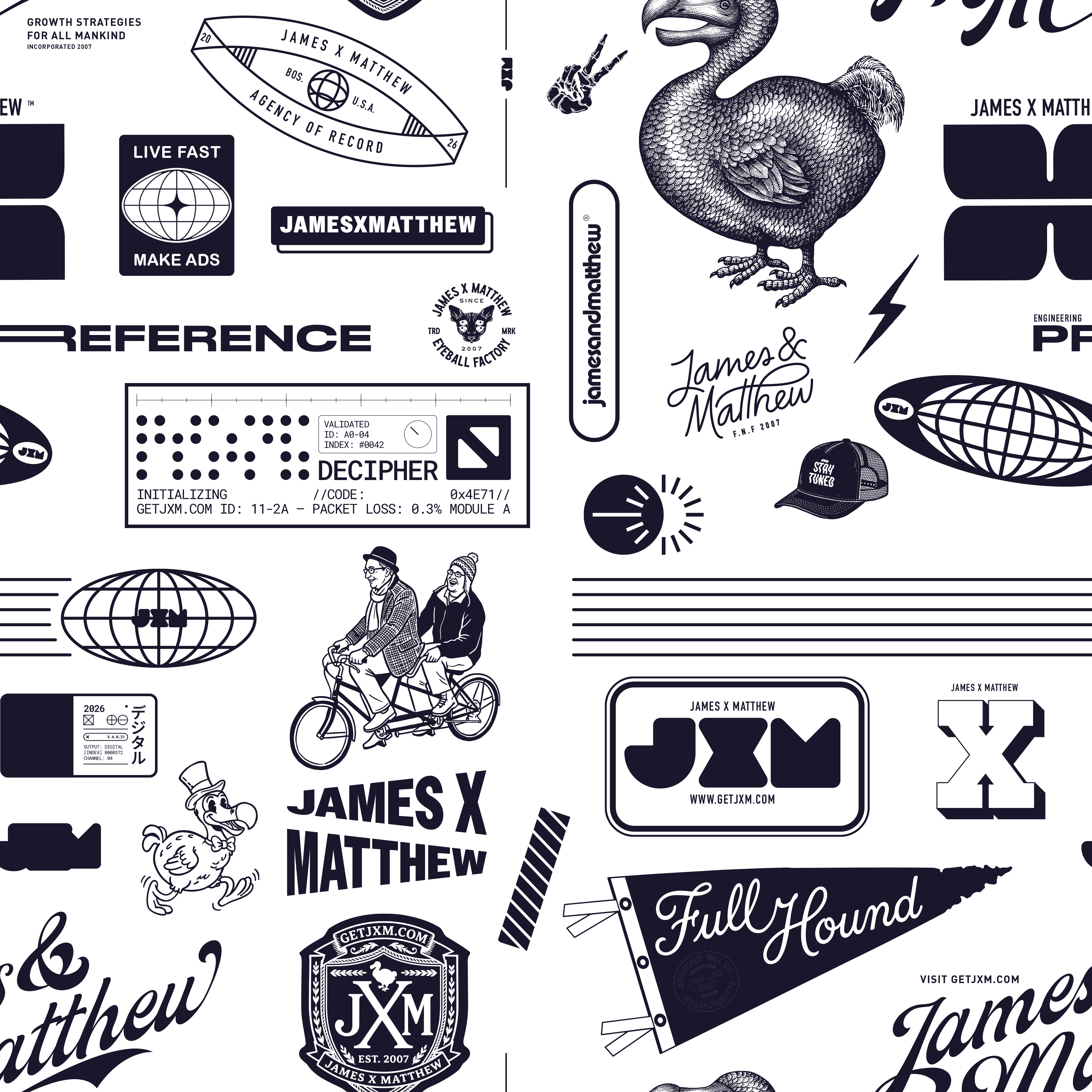
            ['Wordmarks', 'JXM monogram, James X Matthew lockup, script signature, varsity, monolith.'],
            ['Legacy artifacts + mascots', 'Some from heritage (dodo).  Top-hat dodo. Skeleton hand. Tandem cyclists.'],
            ['Badges & seals', 'Agency of Record. Est. 2007 crest. Eyeball Factory trade mark. Decipher panel.'],
            ['Technical marks', '"Validated" panel. Module A. Packet loss. Digital channel card. Decipher braille.'],
            ['Editorial taglines', '"Growth Strategies for All Mankind." "Live Fast, Make Ads." "Stay Tuned." "Full Hound."'],
            ['Geographic seals', 'Boston · Massachusetts · U.S.A. Globes, ovals, latitudes.']].
            map(([t, d], i) =>
            <div key={i} className="card">
                <div style={{ fontFamily: 'var(--ff-display)', fontWeight: 500, fontSize: 16, marginBottom: 8, letterSpacing: '-0.01em' }}>{t}</div>
                <p style={{ fontFamily: 'var(--ff-body)', fontSize: 13, lineHeight: 1.55, color: 'var(--ink-mute)' }}>{d}</p>
              </div>
            )}
          </div>
        </section>

        <section>
          <SectionHead label="1.1.3" title="Treatment Examples" meta="Full · ghosted · special" />
          <div className="grid-3">
            <div style={{ aspectRatio: '4 / 5', background: 'var(--tusk)', position: 'relative', overflow: 'hidden', borderRadius: 4, border: '1px solid var(--line)' }}>
              <img src="assets/pattern.png" alt="" style={{ width: '180%', height: 'auto', position: 'absolute', top: '-20%', left: '-40%', filter: 'brightness(0) saturate(100%) invert(11%) sepia(8%) saturate(2476%) hue-rotate(217deg) brightness(94%) contrast(86%)', opacity: 0.95 }} />
              <span style={{ position: 'absolute', bottom: 14, left: 16, fontFamily: 'var(--ff-mono)', fontSize: 10, letterSpacing: '0.18em', textTransform: 'uppercase', color: 'var(--abyss)', display: 'flex', alignItems: 'center', gap: 4 }}>
                <Glyph name="check" size={11} stroke="var(--abyss)" /> Abyss on Tusk
              </span>
              <span style={{ position: 'absolute', top: 12, right: 14, fontFamily: 'var(--ff-mono)', fontSize: 9, letterSpacing: '0.14em', textTransform: 'uppercase', color: 'var(--abyss)', opacity: 0.55 }}>100%</span>
            </div>
            <div style={{ aspectRatio: '4 / 5', background: 'var(--abyss)', position: 'relative', overflow: 'hidden', borderRadius: 4 }}>
              <img src="assets/pattern.png" alt="" style={{ width: '180%', height: 'auto', position: 'absolute', top: '-20%', left: '-40%', filter: 'invert(1)', opacity: 0.9 }} />
              <span style={{ position: 'absolute', bottom: 14, left: 16, fontFamily: 'var(--ff-mono)', fontSize: 10, letterSpacing: '0.18em', textTransform: 'uppercase', color: 'var(--tusk)', display: 'flex', alignItems: 'center', gap: 4 }}>
                <Glyph name="check" size={11} stroke="var(--tusk)" /> Tusk on Abyss
              </span>
              <span style={{ position: 'absolute', top: 12, right: 14, fontFamily: 'var(--ff-mono)', fontSize: 9, letterSpacing: '0.14em', textTransform: 'uppercase', color: 'var(--tusk)', opacity: 0.55 }}>100%</span>
            </div>
            <div style={{ aspectRatio: '4 / 5', background: 'var(--cedar)', position: 'relative', overflow: 'hidden', borderRadius: 4 }}>
              <img src="assets/pattern.png" alt="" style={{ width: '180%', height: 'auto', position: 'absolute', top: '-20%', left: '-40%', filter: 'brightness(0) saturate(100%) invert(94%) sepia(13%) saturate(178%) hue-rotate(2deg) brightness(96%) contrast(94%)', opacity: 0.9 }} />
              <span style={{ position: 'absolute', bottom: 14, left: 16, fontFamily: 'var(--ff-mono)', fontSize: 10, letterSpacing: '0.18em', textTransform: 'uppercase', color: 'var(--tusk)', display: 'flex', alignItems: 'center', gap: 4 }}>
                <Glyph name="check" size={11} stroke="var(--tusk)" /> Tusk on Cedar
              </span>
              <span style={{ position: 'absolute', top: 12, right: 14, fontFamily: 'var(--ff-mono)', fontSize: 9, letterSpacing: '0.14em', textTransform: 'uppercase', color: 'var(--tusk)', opacity: 0.55 }}>100%</span>
            </div>

            {/* Ghosted / special row */}
            <div style={{ aspectRatio: '4 / 5', background: 'var(--tusk)', position: 'relative', overflow: 'hidden', borderRadius: 4, border: '1px solid var(--line)' }}>
              <img src="assets/pattern.png" alt="" style={{ width: '180%', height: 'auto', position: 'absolute', top: '-20%', left: '-40%', filter: 'brightness(0) saturate(100%) invert(11%) sepia(8%) saturate(2476%) hue-rotate(217deg) brightness(94%) contrast(86%)', opacity: 0.20 }} />
              <span style={{ position: 'absolute', bottom: 14, left: 16, fontFamily: 'var(--ff-mono)', fontSize: 10, letterSpacing: '0.18em', textTransform: 'uppercase', color: 'var(--abyss)', display: 'flex', alignItems: 'center', gap: 4 }}>
                <Glyph name="check" size={11} stroke="var(--abyss)" /> Abyss on Tusk · ghost
              </span>
              <span style={{ position: 'absolute', top: 12, right: 14, fontFamily: 'var(--ff-mono)', fontSize: 9, letterSpacing: '0.14em', textTransform: 'uppercase', color: 'var(--abyss)', opacity: 0.55 }}>20%</span>
            </div>
            <div style={{ aspectRatio: '4 / 5', background: 'var(--abyss)', position: 'relative', overflow: 'hidden', borderRadius: 4 }}>
              <img src="assets/pattern.png" alt="" style={{ width: '180%', height: 'auto', position: 'absolute', top: '-20%', left: '-40%', filter: 'brightness(0)', opacity: 1 }} />
              <span style={{ position: 'absolute', bottom: 14, left: 16, fontFamily: 'var(--ff-mono)', fontSize: 10, letterSpacing: '0.18em', textTransform: 'uppercase', color: 'var(--tusk)', display: 'flex', alignItems: 'center', gap: 4 }}>
                <Glyph name="check" size={11} stroke="var(--tusk)" /> Black on Abyss · debossed
              </span>
              <span style={{ position: 'absolute', top: 12, right: 14, fontFamily: 'var(--ff-mono)', fontSize: 9, letterSpacing: '0.14em', textTransform: 'uppercase', color: 'var(--tusk)', opacity: 0.55 }}>#000 · 100%</span>
            </div>
            <div style={{ aspectRatio: '4 / 5', background: 'var(--cedar)', position: 'relative', overflow: 'hidden', borderRadius: 4 }}>
              <img src="assets/pattern.png" alt="" style={{ width: '180%', height: 'auto', position: 'absolute', top: '-20%', left: '-40%', filter: 'brightness(0) saturate(100%) invert(94%) sepia(13%) saturate(178%) hue-rotate(2deg) brightness(96%) contrast(94%)', opacity: 0.20 }} />
              <span style={{ position: 'absolute', bottom: 14, left: 16, fontFamily: 'var(--ff-mono)', fontSize: 10, letterSpacing: '0.18em', textTransform: 'uppercase', color: 'var(--tusk)', display: 'flex', alignItems: 'center', gap: 4 }}>
                <Glyph name="check" size={11} stroke="var(--tusk)" /> Tusk on Cedar · ghost
              </span>
              <span style={{ position: 'absolute', top: 12, right: 14, fontFamily: 'var(--ff-mono)', fontSize: 9, letterSpacing: '0.14em', textTransform: 'uppercase', color: 'var(--tusk)', opacity: 0.55 }}>20%</span>
            </div>
          </div>
          <div className="callout" style={{ marginTop: 24 }}>
            <div className="callout-eyebrow">When to ghost</div>
            Use <strong>20% opacity</strong> when the pattern lives <em>behind</em> something — section dividers under copy, card backgrounds with text overlaid, hero panels with a headline on top. The <strong>black-on-Abyss debossed</strong> variant is for high-end print or large-format display only — it relies on substrate texture to read.
          </div>
        </section>

        <section>
          <SectionHead label="1.1.4" title="Rules" />
          <div className="grid-3">
            {[
            ['When to use', 'Section dividers. Brand-collateral covers. Social tile backgrounds. Video bumpers. Sparingly.'],
            ['When not to', 'Behind body copy. Behind logos. Tight social formats. As a decorative fix for an empty layout.'],
            ['Treatment', 'Full-bleed or 100% of frame. Never cropped to a card. Never tinted off-palette. Mono only — Abyss on Tusk or vice-versa.']].
            map(([t, d], i) =>
            <div key={i} className="card">
                <div style={{ fontFamily: 'var(--ff-mono)', fontSize: 10, letterSpacing: '0.18em', textTransform: 'uppercase', color: 'var(--ink-mute)', marginBottom: 8 }}>{t}</div>
                <p style={{ fontFamily: 'var(--ff-body)', fontSize: 13.5, lineHeight: 1.55, color: 'var(--ink-soft)' }}>{d}</p>
              </div>
            )}
          </div>
          <div className="callout callout--warn" style={{ marginTop: 24 }}>
            <div className="callout-eyebrow">Don't remix</div>
            Don't pull individual elements out of the pattern and re-use them as standalone marks. The Dodo, varsity script, and other components live <em>in</em> the pattern. If you need a standalone illustrative mark for a specific use, <a href="#request" style={{ borderBottom: '1px solid currentColor' }}>request an asset</a>.
          </div>
        </section>

      </div>
    </div>);

}
window.PatternPage = PatternPage;

/* =========================================================================
   PHOTOGRAPHY
   ========================================================================= */
function PhotographyPage() {
  const Glyph = window.Glyph;
  return (
    <div className="page">
      <PageHeader
        eyebrow="06 · Photography"
        title="Editorial. Atmospheric."
        lede="Black-and-white documentary portraiture and quiet environments. Mid-thought subjects. Things in transition rather than peak action."
      />
      <div className="stack">

        <section>
          <SectionHead label="6.1" title="Direction" />
          <div className="grid-3">
            {[
              ['Mood', 'Considered. Atmospheric. People mid-thought, not mid-laugh. Spaces without their occupants. Detail shots that imply a wider scene.'],
              ['Treatment', 'Black-and-white or deeply desaturated. High contrast. Natural light. 35mm grain. We pick frames a documentary would keep.'],
              ['Subjects', 'Founders, operators, makers — at work, not staged. Workspaces in use. Print, paper, hands, screens. Never the obvious shot.'],
            ].map(([t, d], i) => (
              <div key={i} className="card">
                <div style={{ fontFamily: 'var(--ff-mono)', fontSize: 10, letterSpacing: '0.18em', textTransform: 'uppercase', color: 'var(--ink-mute)', marginBottom: 8 }}>{t}</div>
                <p style={{ fontFamily: 'var(--ff-body)', fontSize: 13.5, lineHeight: 1.6, color: 'var(--ink-soft)' }}>{d}</p>
              </div>
            ))}
          </div>
        </section>

        <section>
          <SectionHead label="6.2" title="Imagery treatment" meta="Atmosphere over literal" />
          <p className="prose" style={{ marginBottom: 24, fontSize: 14, maxWidth: '64ch' }}>
            JXM imagery leans <strong>atmospheric</strong> — vintage editorial photography, B&amp;W texture, deep contrast, hard cropping. We tint with the palette, never with stock filters. The two flagship treatments:
          </p>
          <div style={{ display: 'grid', gridTemplateColumns: 'repeat(12, 1fr)', gap: 16 }}>
            <div style={{ gridColumn: 'span 7', aspectRatio: '1045 / 640', position: 'relative', overflow: 'hidden', borderRadius: 4, background: 'var(--abyss)' }}>
              <img src="assets/hero-1045x640.webp" alt="Vintage editorial — wide crop" style={{ width: '100%', height: '100%', objectFit: 'cover', display: 'block' }} />
              <div style={{ position: 'absolute', bottom: 0, left: 0, right: 0, padding: '32px 22px 18px', background: 'linear-gradient(to top, rgba(34,31,50,0.65), transparent)' }}>
                <span style={{ fontFamily: 'var(--ff-mono)', fontSize: 11, letterSpacing: '0.18em', textTransform: 'uppercase', color: 'var(--tusk)' }}>Cinematic · vintage editorial</span>
              </div>
              <span style={{ position: 'absolute', top: 16, right: 18, fontFamily: 'var(--ff-mono)', fontSize: 10, letterSpacing: '0.14em', textTransform: 'uppercase', color: 'var(--tusk)', opacity: 0.7, background: 'rgba(34,31,50,0.4)', padding: '3px 7px', borderRadius: 2, backdropFilter: 'blur(4px)' }}>16:10 · hero</span>
            </div>
            <div style={{ gridColumn: 'span 5', aspectRatio: '605 / 770', position: 'relative', overflow: 'hidden', borderRadius: 4, background: 'var(--abyss)' }}>
              <img src="assets/value-605x770.webp" alt="Atmospheric texture — paper, eye" style={{ width: '100%', height: '100%', objectFit: 'cover', display: 'block' }} />
              <div style={{ position: 'absolute', bottom: 0, left: 0, right: 0, padding: '32px 22px 18px', background: 'linear-gradient(to top, rgba(34,31,50,0.55), transparent)' }}>
                <span style={{ fontFamily: 'var(--ff-mono)', fontSize: 11, letterSpacing: '0.18em', textTransform: 'uppercase', color: 'var(--tusk)' }}>Texture · monochrome</span>
              </div>
              <span style={{ position: 'absolute', top: 16, right: 18, fontFamily: 'var(--ff-mono)', fontSize: 10, letterSpacing: '0.14em', textTransform: 'uppercase', color: 'var(--tusk)', opacity: 0.7, background: 'rgba(34,31,50,0.4)', padding: '3px 7px', borderRadius: 2, backdropFilter: 'blur(4px)' }}>4:5 · value tile</span>
            </div>
          </div>
          <div className="grid-3" style={{ marginTop: 22 }}>
            {[
              ['Cinematic', 'Found editorial photography — vintage stock, archive footage, color or sepia, character-rich. Used full-bleed at hero scale, with one line of display type. Implies a wider world.'],
              ['Texture', 'B&W abstract or near-abstract macro — paper, fabric, hands, surfaces, light through material. Used at portrait crop next to copy. Carries mood without demanding the eye.'],
              ['Never', 'Stock photo people-pointing-at-laptops. Flat overhead desk shots. Anything that looks like a SaaS landing page from 2019.'],
            ].map(([t, d], i) => (
              <div key={i} className="card">
                <div style={{ fontFamily: 'var(--ff-mono)', fontSize: 10, letterSpacing: '0.18em', textTransform: 'uppercase', color: i === 2 ? 'var(--compassed)' : 'var(--ink-mute)', marginBottom: 8 }}>{t}</div>
                <p style={{ fontFamily: 'var(--ff-body)', fontSize: 13, lineHeight: 1.6, color: 'var(--ink-soft)' }}>{d}</p>
              </div>
            ))}
          </div>

          <div style={{ marginTop: 40 }}>
            <SectionHead label="6.2.1" title="Palette-tinted tiles" meta="When you don't have photography" />
            <p className="prose" style={{ marginBottom: 18, fontSize: 14, maxWidth: '64ch' }}>
              For section dividers, social covers, and video bumpers where a literal image would overpower the message, use palette-tinted atmospheric tiles. Soft radial glows on a dark ground — never more than two glow centers, never off-palette.
            </p>
            <div style={{ display: 'grid', gridTemplateColumns: 'repeat(2, 1fr)', gap: 16 }}>
              <div style={{ aspectRatio: '16 / 10', position: 'relative', overflow: 'hidden', borderRadius: 4, background: 'var(--soylent)' }}>
                <div style={{ position: 'absolute', inset: 0, background: 'radial-gradient(ellipse 80% 60% at 20% 90%, rgba(73, 227, 133, 0.42), transparent 70%), radial-gradient(ellipse 70% 60% at 80% 10%, rgba(189, 222, 237, 0.20), transparent 70%)', mixBlendMode: 'screen' }}></div>
                <span style={{ position: 'absolute', bottom: 18, left: 22, fontFamily: 'var(--ff-mono)', fontSize: 11, letterSpacing: '0.18em', textTransform: 'uppercase', color: 'var(--tusk)', opacity: 0.9 }}>Editorial · atmosphere</span>
                <span style={{ position: 'absolute', top: 18, right: 22, fontFamily: 'var(--ff-mono)', fontSize: 10, letterSpacing: '0.14em', textTransform: 'uppercase', color: 'var(--tusk)', opacity: 0.55 }}>Soylent · Kermit + Fly</span>
              </div>
              <div style={{ aspectRatio: '16 / 10', position: 'relative', overflow: 'hidden', borderRadius: 4, background: 'var(--cedar)' }}>
                <div style={{ position: 'absolute', inset: 0, background: 'radial-gradient(ellipse 60% 70% at 30% 20%, rgba(255, 100, 100, 0.45), transparent 70%), radial-gradient(ellipse 70% 60% at 90% 100%, rgba(94, 79, 245, 0.38), transparent 70%)', mixBlendMode: 'screen' }}></div>
                <span style={{ position: 'absolute', bottom: 18, left: 22, fontFamily: 'var(--ff-mono)', fontSize: 11, letterSpacing: '0.18em', textTransform: 'uppercase', color: 'var(--tusk)', opacity: 0.9 }}>Tinted · duotone</span>
                <span style={{ position: 'absolute', top: 18, right: 22, fontFamily: 'var(--ff-mono)', fontSize: 10, letterSpacing: '0.14em', textTransform: 'uppercase', color: 'var(--tusk)', opacity: 0.55 }}>Cedar · Compassed + Blurple</span>
              </div>
              <div style={{ aspectRatio: '16 / 10', position: 'relative', overflow: 'hidden', borderRadius: 4, background: 'var(--abyss)' }}>
                <div style={{ position: 'absolute', inset: 0, background: 'radial-gradient(ellipse 70% 60% at 50% 50%, rgba(46, 196, 112, 0.45), transparent 70%)', mixBlendMode: 'screen' }}></div>
                <span style={{ position: 'absolute', bottom: 18, left: 22, fontFamily: 'var(--ff-mono)', fontSize: 11, letterSpacing: '0.18em', textTransform: 'uppercase', color: 'var(--tusk)', opacity: 0.9 }}>Wide crop · cinematic</span>
                <span style={{ position: 'absolute', top: 18, right: 22, fontFamily: 'var(--ff-mono)', fontSize: 10, letterSpacing: '0.14em', textTransform: 'uppercase', color: 'var(--tusk)', opacity: 0.55 }}>Abyss · Gator</span>
              </div>
              <div style={{ aspectRatio: '16 / 10', position: 'relative', overflow: 'hidden', borderRadius: 4, background: 'var(--soylent)' }}>
                <div style={{ position: 'absolute', inset: 0, background: 'radial-gradient(ellipse 90% 70% at 50% 100%, rgba(189, 222, 237, 0.22), transparent 70%)', mixBlendMode: 'screen' }}></div>
                <span style={{ position: 'absolute', bottom: 18, left: 22, fontFamily: 'var(--ff-mono)', fontSize: 11, letterSpacing: '0.18em', textTransform: 'uppercase', color: 'var(--tusk)', opacity: 0.9 }}>Ambient · quiet</span>
                <span style={{ position: 'absolute', top: 18, right: 22, fontFamily: 'var(--ff-mono)', fontSize: 10, letterSpacing: '0.14em', textTransform: 'uppercase', color: 'var(--tusk)', opacity: 0.55 }}>Soylent · Fly</span>
              </div>
            </div>
            <div style={{ marginTop: 22 }}>
              <div className="code-head"><span>CSS · single-glow recipe</span><CopyButton text={`.imagery-tile {\n  position: relative;\n  background: var(--soylent);\n  aspect-ratio: 4 / 5;\n  overflow: hidden;\n}\n.imagery-tile::after {\n  content: "";\n  position: absolute;\n  inset: 0;\n  background:\n    radial-gradient(ellipse 80% 60% at 20% 90%, rgba(73, 227, 133, 0.42), transparent 70%),\n    radial-gradient(ellipse 70% 60% at 80% 10%, rgba(189, 222, 237, 0.20), transparent 70%);\n  mix-blend-mode: screen;\n}`} /></div>
              <pre className="code">{`.imagery-tile {
  position: relative;
  background: var(--soylent);
  aspect-ratio: 4 / 5;
  overflow: hidden;
}
.imagery-tile::after {
  content: "";
  position: absolute;
  inset: 0;
  background:
    radial-gradient(ellipse 80% 60% at 20% 90%,
      rgba(73, 227, 133, 0.42), transparent 70%),
    radial-gradient(ellipse 70% 60% at 80% 10%,
      rgba(189, 222, 237, 0.20), transparent 70%);
  mix-blend-mode: screen;
}`}</pre>
            </div>
          </div>
        </section>

        <section>
          <SectionHead label="6.3" title="Treatment recipe" meta="In Lightroom / Capture One" />
          <div className="grid-2">
            <div>
              <div className="code-head"><span>BW conversion · starting point</span><CopyButton text={`Profile: Adobe Monochrome\nExposure: ±0.0\nContrast: +25 to +35\nHighlights: -20\nShadows: +15\nWhites: +10\nBlacks: -15\nClarity: +10\nTexture: +8\nGrain: amount 25 / size 25 / roughness 50`} /></div>
              <pre className="code">{`Profile     Adobe Monochrome
Exposure    ±0.0
Contrast    +25 to +35
Highlights  -20
Shadows     +15
Whites      +10
Blacks      -15
Clarity     +10
Texture     +8
Grain       25 / 25 / 50`}</pre>
            </div>
            <div>
              <div className="code-head"><span>If color · low-sat treatment</span><CopyButton text={`Saturation: -65\nVibrance: -20\nTemp: cool by 200K\nTint: neutral\nSplit-tone shadows: subtle Abyss (#221F32) at 10%\nSplit-tone highlights: subtle Tusk (#F7F2EB) at 8%\nGrain: amount 20`} /></div>
              <pre className="code">{`Saturation   -65
Vibrance     -20
Temp         cool by 200K
Tint         neutral
Split-tone   Abyss in shadows · 10%
             Tusk in highlights · 8%
Grain        amount 20`}</pre>
            </div>
          </div>
          <div className="callout" style={{ marginTop: 20 }}>
            <div className="callout-eyebrow">Why these numbers</div>
            The recipe holds detail in faces and clothing while crushing backgrounds into near-Abyss. The grain reads as paper, not noise. If the shot needs more than these moves, the shot is wrong — re-shoot, don't rescue.
          </div>
        </section>

        <section>
          <SectionHead label="6.4" title="Cropping" />
          <div className="grid-3">
            {[
              { ratio: '4 / 5', label: '4:5 · portrait', use: 'Social, press kit, profile.' },
              { ratio: '3 / 2', label: '3:2 · classic', use: 'Editorial, case studies.' },
              { ratio: '16 / 9', label: '16:9 · cinematic', use: 'Hero, full-bleed, video stills.' },
            ].map((c, i) => (
              <div key={i} className="card">
                <div style={{ aspectRatio: c.ratio, background: 'var(--abyss)', borderRadius: 2, marginBottom: 14, position: 'relative', overflow: 'hidden' }}>
                  <img src="assets/founders.webp" alt="" style={{ width: '100%', height: '100%', objectFit: 'cover', objectPosition: 'center 35%' }} />
                </div>
                <div style={{ fontFamily: 'var(--ff-display)', fontWeight: 500, fontSize: 15, color: 'var(--ink)', letterSpacing: '-0.005em' }}>{c.label}</div>
                <div style={{ fontFamily: 'var(--ff-body)', fontSize: 12.5, color: 'var(--ink-mute)', marginTop: 4 }}>{c.use}</div>
              </div>
            ))}
          </div>
          <div className="callout" style={{ marginTop: 20 }}>
            <div className="callout-eyebrow">Composition</div>
            Off-center subjects. Use the rule of thirds where you can. Avoid centered head-on portraits unless the gaze is the whole point. Images should not feel like stock at all.
          </div>
        </section>

        <section>
          <SectionHead label="6.5" title="Do / Don't" />
          <div className="grid-2">
            <div className="card">
              <div style={{ fontFamily: 'var(--ff-mono)', fontSize: 10, letterSpacing: '0.18em', textTransform: 'uppercase', color: 'var(--kermit)', marginBottom: 14 }}>Do</div>
              <ul style={{ margin: 0, padding: 0, listStyle: 'none' }}>
                {[
                  'Shoot in natural light. Find the window.',
                  'Use 35mm or 50mm equivalent. No wide-angle distortion.',
                  'Direct subjects mid-conversation, not just mid-pose.',
                  'Let texture earn its place.',
                  'Convert to B&W or aggressive desaturation.',
                ].map((l, i) => (
                  <li key={i} style={{ padding: '10px 0', borderTop: i === 0 ? 'none' : '1px dashed var(--line)', fontFamily: 'var(--ff-body)', fontSize: 13.5, color: 'var(--ink)' }}>{l}</li>
                ))}
              </ul>
            </div>
            <div className="card">
              <div style={{ fontFamily: 'var(--ff-mono)', fontSize: 10, letterSpacing: '0.18em', textTransform: 'uppercase', color: 'var(--compassed)', marginBottom: 14 }}>Don't</div>
              <ul style={{ margin: 0, padding: 0, listStyle: 'none' }}>
                {[
                  'Use anything that feels like standard stock photography. Ever.',
                  'Force smiles or thumbs-up shots.',
                  'Shoot on bright primary backdrops.',
                  'Use lens flares, sparkles, gradient overlays.',
                  'Crop a face dead-center with no air.',
                  'Color-tint with off-palette hues.',
                ].map((l, i) => (
                  <li key={i} style={{ padding: '10px 0', borderTop: i === 0 ? 'none' : '1px dashed var(--line)', fontFamily: 'var(--ff-body)', fontSize: 13.5, color: 'var(--ink-soft)' }}>{l}</li>
                ))}
              </ul>
            </div>
          </div>
        </section>

        <section>
          <SectionHead label="6.6" title="For AI generation" meta="Midjourney suffix" />
          <div className="callout">
            <div className="callout-eyebrow">Cross-reference</div>
            Full Midjourney style strings live on the <a href="#ai-mj" style={{ borderBottom: '1px solid currentColor' }}>AI prompts → Midjourney page</a>. The short version below works as a stylistic suffix on any image-gen prompt.
          </div>
          <div style={{ marginTop: 18 }}>
            <div className="code-head"><span>image-gen · style suffix</span><CopyButton text={`black and white, editorial documentary, 35mm grain, natural light, low saturation, deep contrast, mid-thought subject, atmospheric, no stock photography, no smiles, --style raw --ar 4:5 --s 50`} /></div>
            <pre className="code" style={{ whiteSpace: 'pre-wrap' }}>{`black and white, editorial documentary, 35mm grain, natural light, low saturation, deep contrast, mid-thought subject, atmospheric, no stock photography, no smiles, --style raw --ar 4:5 --s 50`}</pre>
          </div>
        </section>
      </div>
    </div>
  );
}
window.PhotographyPage = PhotographyPage;

/* =========================================================================
   MOODBOARD
   ========================================================================= */
function MoodboardPage() {
  const Glyph = window.Glyph;
  const COSMOS_URL = "https://www.cosmos.so/mattmaguy/jxm";
  const COSMOS_CANVAS_URL = "https://www.cosmos.so/mattmaguy/jxm/canvas";
  return (
    <div className="page">
      <PageHeader
        eyebrow="07 · Moodboard"
        title="Where the vibe lives."
        lede="A living collection of references — film stills, editorial design, photography, type specimens, motion. Updated as the brand evolves. Bookmark it."
      />
      <div className="stack">

        <section>
          <div style={{ color: 'var(--ink)', marginBottom: 14, lineHeight: 0 }} aria-label="COSMOS">
            <svg xmlns="http://www.w3.org/2000/svg" width="140" height="24" viewBox="0 0 249.2 42" fill="currentColor">
              <g clipPath="url(#cosmos-mark)">
                <path d="M233.803 42c-9.683 0-15.983-5.25-16.8-13.067h7.525c1.225 4.667 5.017 6.417 9.275 6.417 4.375 0 7.409-2.158 7.409-5.192 0-3.325-2.45-4.666-7.875-5.833l-3.559-.758c-5.95-1.284-11.433-4.375-11.433-11.375 0-6.942 6.008-12.192 14.7-12.192 8.983 0 14.175 4.9 15.458 12.542h-7.525c-.933-3.909-3.558-5.95-7.933-5.95-4.317 0-7 2.158-7 5.016 0 2.917 2.45 4.084 7.175 5.192l3.558.817c6.534 1.516 12.309 4.316 12.309 11.841 0 7.292-6.067 12.542-15.284 12.542M193.496 42c-11.725 0-20.709-8.808-20.709-21s8.984-21 20.709-21 20.708 8.808 20.708 21-8.983 21-20.708 21m0-7c7.525 0 12.658-6.125 12.658-14s-5.133-14-12.658-14-12.659 6.125-12.659 14 5.134 14 12.659 14M132.159 41.125h-6.942V.875h11.317l10.208 30.1 10.325-30.1h10.85v40.25h-7V8.4l-10.85 32.725h-6.941l-10.967-32.9zM104.625 42c-9.684 0-15.984-5.25-16.8-13.067h7.525c1.225 4.667 5.016 6.417 9.275 6.417 4.375 0 7.408-2.158 7.408-5.192 0-3.325-2.45-4.666-7.875-5.833l-3.558-.758c-5.95-1.284-11.434-4.375-11.434-11.375C89.166 5.25 95.175 0 103.866 0c8.984 0 14.175 4.9 15.459 12.542H111.8c-.934-3.909-3.559-5.95-7.934-5.95-4.316 0-7 2.158-7 5.016 0 2.917 2.45 4.084 7.175 5.192l3.559.817c6.533 1.516 12.308 4.316 12.308 11.841 0 7.292-6.067 12.542-15.283 12.542M64.317 42c-11.725 0-20.708-8.808-20.708-21S52.592 0 64.316 0s20.708 8.808 20.708 21-8.983 21-20.708 21m0-7c7.525 0 12.658-6.125 12.658-14S71.842 7 64.317 7s-12.658 6.125-12.658 14 5.133 14 12.658 14M20.708 42C9.158 42 0 33.308 0 21.058 0 8.867 9.158 0 20.708 0 30.917 0 38.792 6.475 40.6 16.1h-7.992c-1.575-5.367-5.95-9.1-11.9-9.1C13.242 7 8.05 12.95 8.05 21c0 7.933 5.192 14 12.658 14 5.775 0 10.092-3.442 11.784-8.517h8.05C38.617 35.7 30.858 42 20.708 42"/>
              </g>
              <defs>
                <clipPath id="cosmos-mark">
                  <path d="M0 0h249.2v42H0z"/>
                </clipPath>
              </defs>
            </svg>
          </div>
          <SectionHead label="7.1" title="The board" meta="Hosted on Cosmos · public" />
          <div style={{ height: 600, borderRadius: 6, overflow: 'hidden', border: '1px solid var(--line-strong)', background: 'var(--bg-elev-2)' }}>
            <iframe
              src={COSMOS_CANVAS_URL}
              title="JXM on Cosmos — canvas"
              style={{ width: '100%', height: '100%', border: 0, display: 'block' }}
              loading="lazy"
              referrerPolicy="no-referrer-when-downgrade"
            />
          </div>
          <div style={{ display: 'flex', justifyContent: 'space-between', alignItems: 'center', marginTop: 14, gap: 16, flexWrap: 'wrap' }}>
            <p style={{ fontFamily: 'var(--ff-body)', fontSize: 14, color: 'var(--ink-soft)', margin: 0, maxWidth: '54ch', lineHeight: 1.6 }}>
              Scroll the canvas above to browse references. Open the full board in a new tab for caption details, item info, and the side panel. No account needed to view.
            </p>
            <a href={COSMOS_URL} target="_blank" rel="noopener" className="jbtn jbtn--outline jbtn--display">Open the board <Glyph name="arr-up" size={14} stroke="currentColor" /></a>
          </div>
          <div style={{ fontFamily: 'var(--ff-mono)', fontSize: 10, letterSpacing: '0.14em', textTransform: 'uppercase', color: 'var(--ink-mute)', marginTop: 8 }}>{COSMOS_URL.replace('https://', '')}</div>
        </section>

        <section>
          <SectionHead label="7.2" title="What's on it" />
          <div className="grid-3">
            {[
              ['Editorial', 'Magazine spreads, book design, posters. The reference points for our type and grid.'],
              ['Photography', 'Documentary, environmental, mid-thought. Low-saturation work we wish we shot ourselves.'],
              ['Motion', 'Title sequences, brand films, kinetic type. The pace and texture we move at.'],
              ['Type', 'Specimens, paired typography, pull quotes. Things we&rsquo;d steal if they weren&rsquo;t already taken.'],
              ['Color', 'Naturals, earthy darks, single-accent palettes. The world our colors live in.'],
              ['Anti-references', 'Stuff we&rsquo;d never make. Useful for showing partners what we&rsquo;re not.'],
            ].map(([t, d], i) => (
              <div key={i} className="card">
                <div style={{ fontFamily: 'var(--ff-display)', fontWeight: 500, fontSize: 16, marginBottom: 8, letterSpacing: '-0.005em' }}>{t}</div>
                <p style={{ fontFamily: 'var(--ff-body)', fontSize: 13, lineHeight: 1.55, color: 'var(--ink-mute)' }} dangerouslySetInnerHTML={{ __html: d }}></p>
              </div>
            ))}
          </div>
        </section>

        <section>
          <SectionHead label="7.3" title="How to use it" />
          <div className="grid-2">
            <div className="card">
              <div style={{ fontFamily: 'var(--ff-mono)', fontSize: 10, letterSpacing: '0.18em', textTransform: 'uppercase', color: 'var(--accent-ink)', marginBottom: 12 }}>Designing for JXM</div>
              <p style={{ fontFamily: 'var(--ff-body)', fontSize: 13.5, lineHeight: 1.6, color: 'var(--ink-soft)', margin: 0 }}>
                Skim the board before starting any new piece. You're not copying any single reference — you&rsquo;re calibrating to the room. If three references in a row feel like the wrong room, ask before you ship.
              </p>
            </div>
            <div className="card">
              <div style={{ fontFamily: 'var(--ff-mono)', fontSize: 10, letterSpacing: '0.18em', textTransform: 'uppercase', color: 'var(--accent-ink)', marginBottom: 12 }}>Suggesting additions</div>
              <p style={{ fontFamily: 'var(--ff-body)', fontSize: 13.5, lineHeight: 1.6, color: 'var(--ink-soft)', margin: 0 }}>
                Found something the board should have? Send the link or screenshot to <a href="mailto:hi@getjxm.com" style={{ borderBottom: '1px solid currentColor' }}>hi@getjxm.com</a> with one sentence on why. Curated additions go up monthly; off-brand suggestions get a polite no-thanks.
              </p>
            </div>
          </div>
          <div className="callout" style={{ marginTop: 24 }}>
            <div className="callout-eyebrow">Cadence</div>
            The board is reviewed monthly. Items that no longer represent where the brand is going get pulled. If a reference you&rsquo;ve been using disappears, that&rsquo;s a signal — check the new ones.
          </div>
        </section>

      </div>
    </div>
  );
}
window.MoodboardPage = MoodboardPage;

/* =========================================================================
   VIDEO
   ========================================================================= */
function VideoPage() {
  const Glyph = window.Glyph;
  const REEL = { id: "1183815657", url: "https://vimeo.com/1183815657" };
  const LOOP = { id: "1190936504", hash: "9afe0d55a1", url: "https://vimeo.com/1190936504/9afe0d55a1" };

  const CASE_STUDIES = [
    { id: "1092840695", client: "NWFCU", title: "NWFCU × JXM", context: "Matt walks through the project. Use as a credibility add in new-business decks for credit-union or financial-services pitches." },
    { id: "1092840544", client: "Harvard FCU", title: "Harvard FCU × JXM", context: "Matt walks through the project. Use when the audience needs a brand-positioning case for a member-owned institution." },
    { id: "1092840347", client: "Advia", title: "Advia × JXM", context: "Matt walks through the project. Use for examples of multi-product growth strategy in regional CU contexts." },
    { id: "1092608603", client: "MDA", title: "MDA × JXM", context: "Matt walks through the project. Use when the audience needs a mission-driven, non-CU case study." },
    { id: "1092578762", client: "CAP COM × Siena Saints", title: "CAP COM × Siena Saints", context: "Matt walks through the project. Use for sponsorship / partnership activation examples." },
  ];

  const embed = (id, hash) => `https://player.vimeo.com/video/${id}${hash ? '?h=' + hash + '&' : '?'}title=0&byline=0&portrait=0`;

  return (
    <div className="page">
      <PageHeader
        eyebrow="08 · Video"
        title="On screen."
        lede="Where the JXM brand moves. The reel, the loop, and the approved case-study library — everything you can reach for without asking."
      />
      <div className="stack">

        <section>
          <SectionHead label="8.1" title="Reel" meta="Vimeo · embedded" />
          <div style={{ position: 'relative', paddingTop: '56.25%', borderRadius: 6, overflow: 'hidden', background: 'var(--abyss)' }}>
            <iframe
              src={embed(REEL.id)}
              frameBorder="0"
              allow="autoplay; fullscreen; picture-in-picture"
              allowFullScreen
              style={{ position: 'absolute', top: 0, left: 0, width: '100%', height: '100%', border: 0 }}
              title="JXM 2026 reel"
            />
          </div>
          <div style={{ display: 'flex', justifyContent: 'space-between', alignItems: 'center', marginTop: 14, gap: 16, flexWrap: 'wrap' }}>
            <p style={{ fontFamily: 'var(--ff-body)', fontSize: 14, color: 'var(--ink-soft)', margin: 0, maxWidth: '54ch', lineHeight: 1.6 }}>
              A two-minute cut of recent campaign and brand work. Use as the open for new-business meetings, conference talks, partner intros. Don&rsquo;t cut down or re-edit — link to the canonical version so the cut stays current as we add work.
            </p>
            <a href={REEL.url} target="_blank" rel="noopener" className="jbtn jbtn--outline jbtn--display">Open on Vimeo <Glyph name="arr-up" size={14} stroke="currentColor" /></a>
          </div>
        </section>

        <section>
          <SectionHead label="8.2" title="Loop" meta="Short cut · ambient use" />
          <div style={{ position: 'relative', paddingTop: '56.25%', borderRadius: 6, overflow: 'hidden', background: 'var(--abyss)' }}>
            <iframe
              src={embed(LOOP.id, LOOP.hash)}
              frameBorder="0"
              allow="autoplay; fullscreen; picture-in-picture"
              allowFullScreen
              style={{ position: 'absolute', top: 0, left: 0, width: '100%', height: '100%', border: 0 }}
              title="JXM reel · short loop"
            />
          </div>
          <div style={{ display: 'flex', justifyContent: 'space-between', alignItems: 'center', marginTop: 14, gap: 16, flexWrap: 'wrap' }}>
            <p style={{ fontFamily: 'var(--ff-body)', fontSize: 14, color: 'var(--ink-soft)', margin: 0, maxWidth: '54ch', lineHeight: 1.6 }}>
              A shorter cut for ambient placements — lobby screens, hero loops on partner sites, social tile backgrounds, conference idle states. Plays muted by default; let the visuals carry it.
            </p>
            <a href={LOOP.url} target="_blank" rel="noopener" className="jbtn jbtn--outline jbtn--display">Open on Vimeo <Glyph name="arr-up" size={14} stroke="currentColor" /></a>
          </div>
        </section>

        <section>
          <SectionHead label="8.3" title="Case studies" meta={`${CASE_STUDIES.length} clips · Matt VO`} />
          <p className="prose" style={{ marginBottom: 24, fontSize: 14 }}>
            Each clip is a project walk-through with a voice-over from Matt. Drop into decks where the audience needs more than a logo wall — they need to hear the reasoning. Embed via Vimeo or share the link; don&rsquo;t download and re-host.
          </p>
          <div className="grid-3">
            {CASE_STUDIES.map((c, i) => (
              <div key={i} className="card" style={{ padding: 0, overflow: 'hidden', display: 'flex', flexDirection: 'column' }}>
                <div style={{ position: 'relative', paddingTop: '56.25%', background: 'var(--abyss)' }}>
                  <iframe
                    src={embed(c.id)}
                    frameBorder="0"
                    allow="autoplay; fullscreen; picture-in-picture"
                    allowFullScreen
                    style={{ position: 'absolute', top: 0, left: 0, width: '100%', height: '100%', border: 0 }}
                    title={c.title}
                  />
                </div>
                <div style={{ padding: '14px 16px', display: 'flex', flexDirection: 'column', gap: 6, flex: 1 }}>
                  <div style={{ fontFamily: 'var(--ff-mono)', fontSize: 10, letterSpacing: '0.16em', textTransform: 'uppercase', color: 'var(--accent-ink)' }}>Case study</div>
                  <div style={{ fontFamily: 'var(--ff-display)', fontWeight: 500, fontSize: 16, letterSpacing: '-0.005em' }}>{c.title}</div>
                  <div style={{ fontFamily: 'var(--ff-body)', fontSize: 12.5, color: 'var(--ink-mute)', lineHeight: 1.55, flex: 1 }}>{c.context}</div>
                  <a href={`https://vimeo.com/${c.id}`} target="_blank" rel="noopener" style={{ fontFamily: 'var(--ff-mono)', fontSize: 10, letterSpacing: '0.14em', textTransform: 'uppercase', color: 'var(--ink-mute)', borderBottom: '1px solid var(--line-strong)', alignSelf: 'flex-start', paddingBottom: 2, marginTop: 4 }}>Open on Vimeo ↗</a>
                </div>
              </div>
            ))}
          </div>
        </section>

        <section>
          <SectionHead label="8.4" title="Usage" />
          <div className="grid-3">
            <div className="card">
              <div style={{ fontFamily: 'var(--ff-mono)', fontSize: 10, letterSpacing: '0.18em', textTransform: 'uppercase', color: 'var(--ink-mute)', marginBottom: 8 }}>Where to use</div>
              <p style={{ fontFamily: 'var(--ff-body)', fontSize: 13, lineHeight: 1.55, color: 'var(--ink-soft)', margin: 0 }}>Decks, social posts, partner emails, conference loops, hero modules on third-party features. The reel opens; the clips fill in.</p>
            </div>
            <div className="card">
              <div style={{ fontFamily: 'var(--ff-mono)', fontSize: 10, letterSpacing: '0.18em', textTransform: 'uppercase', color: 'var(--ink-mute)', marginBottom: 8 }}>Where not to</div>
              <p style={{ fontFamily: 'var(--ff-body)', fontSize: 13, lineHeight: 1.55, color: 'var(--ink-soft)', margin: 0 }}>Don&rsquo;t re-cut the reel. Don&rsquo;t add captions or watermarks. Don&rsquo;t reupload to other accounts — embed or link to the canonical Vimeo source so it stays in sync.</p>
            </div>
            <div className="card">
              <div style={{ fontFamily: 'var(--ff-mono)', fontSize: 10, letterSpacing: '0.18em', textTransform: 'uppercase', color: 'var(--ink-mute)', marginBottom: 8 }}>Need something else</div>
              <p style={{ fontFamily: 'var(--ff-body)', fontSize: 13, lineHeight: 1.55, color: 'var(--ink-soft)', margin: 0 }}>Vertical cut, looped GIF, a specific clip pulled from the reel, transcoded to a different codec — <a href="#request" onClick={(e) => { e.preventDefault(); window.location.hash = 'request'; }} style={{ borderBottom: '1px solid currentColor' }}>open an asset request</a>.</p>
            </div>
          </div>
          <div className="callout" style={{ marginTop: 24 }}>
            <div className="callout-eyebrow">Looking ahead</div>
            Logo stinger, campaign-specific bumpers, social cuts, and vertical reformats are on the roadmap. Add to <a href="#downloads" onClick={(e) => { e.preventDefault(); window.location.hash = 'downloads'; }} style={{ borderBottom: '1px solid currentColor' }}>Downloads</a> as they ship.
          </div>
        </section>

      </div>
    </div>
  );
}
window.VideoPage = VideoPage;